Monday, 16 April 2012
Double Page Spread: Final Product

This is the final product of my double page spread. As a whole I feel that I have managed to achieve an authentic looking feature that would attract readers to want to get to know more about my artist ‘Christina B’. I have put a lot of thought into the composition of the different aspects of the feature. The ‘Quick Fire Questions’ will attract my younger readers as they will feel that there is a fun side to my magazine. Overall I have tried my best to make my double page spread as authentic looking as possible in order to make it appeal to those interested in buying my magazine.
Contents Page: Final Product

Above is an image of my final contents page for my music magazine. It took me quite a while to come up with a suitable composition for all of the items I placed onto my page. Looking at the final piece, I feel that it shows how much effort I put in to the little details such as the shape underneath the word ‘Gossip’. I thought a lot about what each piece of text on the page would mean to a reader and how it would entice them to read on. Overall I am quite happy about my approach to creating a music magazine contents page.
Friday, 23 March 2012
Screening in Photoshop
 |
| Original Photograph |
 |
| Screened once |
 |
| Screened twice |

By manipulating this photograph, I was able to create a brighter looking image. I felt that this was necessary as otherwise the image would not fit in the bright and catchy theme I had in practice for my magazine pages. Using a helpful tutorial on YouTube, I was able to lighten my photograph for my double page spread quickly and easily. It goes to show how Web 2.0 can have an impact on the progress of my media coursework!
See the difference?
 |
| Before |


After
 This is the photo after going through many different stages in Photoshop. I made sure that I did not over edit the picture so that it would stay looking natural (which is the whole point of the pose on the grass). As you can see I have removed some lines from the cheeks and neck area with a mixture of the 'magic wand tool' and the 'healing brush tool' to give me a smoother and clearer surface. I also played around with the brightness and contrast of the image.

By adding the pink border and low opacity pink box behind the text of the ‘Quick Fire Questions’, I felt that it made the text stand out. This would draw the attention of the reader to this part of the article. The reason I felt that this was necessary was because this is the fun part of the magazine. It is there to prevent the reader from dismissing the page if they thought it looked uninteresting


Monday, 12 March 2012
Front Cover: Final Product

This is the final product of my front cover. I am definitely pleased that I have been able to create a professional looking piece that resembles pop music today in my opinion. I thought a lot about the composition of each part of my page and put a great deal of effort into manipulating the main image. The text that I placed onto my page is clearly laid out in an ordered way. Any text that I placed at an angle was to emphasise to fun factor of my magazine and the image I used. I tried my best to make my magazine title looking authentic and fun, I think I succeeded in doing so as it is eye catching and clear to the eye.
Samples
 |
This was the original font I intended to use for my title, however, i found that when editing on Photoshop, it was difficult to clean the edges of the text. The overall finish was rough looking and i though that this would go against the image I had for my magazine of clean cut and original. |
 |
| This was the font I chose next as I thought it screamed pop music. However, upon placing the text onto my image it looked to me as if it was made for a children's magazine as opposed to a magazine targeted at teenagers. Once again, I had to look for an alternative. |
Sunday, 11 March 2012
'WE LOVE POP'

I was drawn to the way the text is laid around the sides of the magazine. The text is layered over coloured boxes which makes it not only easy to read, but it is also more eye-catching. I like the way it looks simple (text font and colour wise) as it allows the main feature to stand out. There is never too much text within the boxes, this helps the appeal of the magazine as a magazine for older teenagers as it is less cluttered unlike magazines such as 'top of the pops'. I have decided to go for the this overall look on my own magazine as I feel it caters best for my target audience of older teenage girls.


Title: Front Cover
The first part of my title: 'POP' is very significant to my magazine as it will instantly let the reader know what type of music genre my magazine caters for. Due to this, I decided to use Photoshop to directly manipulate the text to make it look interesting to catch the eye of my reader.

Filmotype Gem™
 |
| I used Photoshop to merge the text and the image together. |
 |
| This is the final result. |
Interview: Double Page Spread
(I later on altered the amount of text to fit accurately onto my double page spread. Some sentences were also changed to anchor its appeal to a younger audience).
Title: Under the skin of... Christina B
Title: Under the skin of... Christina B
So Christina, what inspired you to start singing?
Well, ever since I was about 10 I used to get really excited about watching those singing programmes on the television every Saturday night. It was always my dream to be like the girls on the shows, with all the makeup and great comments from the judges. I think that because the people around me always tried to put me down and discourage me from going along with my dream of being a pop singer had given me the drive to carry on. As I got older though, I started to realise how hard it would be to emerge in the music industry as an upcoming artist. Okay, don’t laugh at me but, I really admire the way Justin Bieber started from nothing, to becoming one of the most known pop artists around the world through his videos on YouTube. This kind of idea is what I have been using to help me become noticed.
Monday, 5 March 2012
Front Cover Image

Tuesday, 28 February 2012
Sneak peek!
Sneak peek: One of my photographs!


This picture was found AFTER I took my initial photos. I found it quite astonishing that I was able to create a similar photo to this professional one of Cher Lloyd. I feel that I have achieved some very good photos and i will have a good range to choose from for my magazine.
Monday, 27 February 2012
Inspiration!

Friday, 24 February 2012
This fun aspect of pop is what I want to incorporate into my own pop magazine!
Sunday, 19 February 2012
Saturday, 18 February 2012
Shot List:


Thursday, 16 February 2012
Flat Plan
In order for the production of my magazine to run smoother, I have created a flat plan for all of the pages I will be creating. They will serve as a guide as to how the information I include on my pages are to be laid out.
 |
| Front cover |
As I will prefer to have a shot and snappy title, it will be bold and large to make it stand out more at the top of the page this will catch the eye of a potential consumer making it more likely that they will purchase it (that is if my magazine were to be put on the market). Some ideas I had were either something similar to 'RAW' or a spin on the word 'pop' such as 'Pop-sane!'. In turn I thought that my model should be wearing some sort of animal printed clothing to mirror the take on the word 'roar' which I turned to 'raw'. The word 'raw' to me, would relate to the gossip side of my magazine with it being 'raw' and 'fresh'. However I decided to settle with something that would instantly tell the reader what the magazine is about. 'POP CRAZE' was the best one I could pick as it screamed pop music and gave off the feel of a young, fun and of course crazy magazine .
The quote layered over part of the model is a common feature of a magazine which contains within it some sort of interview. Since my double page spread will consist of an interview, I thought that the quote on the front cover may entice the reader to read inside the magazine. I see it as a 'teaser', to make the reader want to read on.
The circle nearby the models shoulder which contains the text 'EXCLUSIVE INTERVIEW INSIDE' is included as I thought that this would create an authentic look to my magazine, it will hopefully make my front cover look more official.
The overall layout of the pull quotes and features inside etc. around the model is not to overcrowded as I have observed on some pop music magazines for teen girls (such as magazine 'top of the pops'). I wanted to create a look that was simple yet interesting at the same time.
 |
| Contents page |
CONTENTS PAGE: Many of the contents pages in the magazines I have looked at are pretty simple in the way the information is laid out. For my magazine, although I am going for the more mature approach to the traditionally girly teen pop magazine I have decided to create a contents page flat plan with elements that will hopefully serve as yet another 'teaser' to make the reader want to read on.
The heading of the page 'CONTENTS' appears slightly deformed (to the untrained eye!), however my aim was to make it appear as if the title is so packed with gossip that it has started to leak. Now that revisit my drawing, I think that this should have actually been underneath the word 'GOSSIP!' which would be playing on the phrase 'JUICIEST GOSSIP!'.
I have made sure to include a picture of the same model on my front cover on my contents page so that the reader will know that there is a feature about her further into the magazine. This is also to ensure that my magazine will have a running theme (continuity). I have also made the contents title purple to match the title on the front cover.
I have always had the idea in my mind to make my magazine fun in a subtle way, so after researching different music magazines I was pleased to see that this could be achieved with the smallest of features. As you can see, some of the pictures are shown as Polaroids, I decided to include these to add that scrapbook feel to the page; making the reader feel a sense of ownership of the magazine.
The shape on the bottom right hand corner is there to catch the eye of the reader. Within it contains the text 'EXTRAS', again running with the idea of subtle fun, I have decided to include perhaps the text 'free poster' as from my questionnaire I found that some of the people I asked enjoyed having free posters in a music magazine.
 |
| Double page spread |
The pull quote is placed at a slanted angle to give the page more of a interesting perspective and so that not everything is placed straight, it to make to page look more interesting. It is also quite common in magazines so I know my double page spread will look more authentic with this feature on it.
I have also included a box on the bottom of the head and shoulders shot sub-headed 'FIRE QUESTION TIME', this is where I plan to provide the reader with short, snappy and fun questions and answers from my artist.
Questionnaire: Results/ analysis
In order to find out more about what my target audience of 13- 18 year old girls prefer, I created a questionnaire devised of both quantitative and qualitative based questions. The quantitative based questions allowed me to present my results/data in an easy way to read and analyse the differences in opinions. The qualitative based questions can prompt people to express their opinions in more detail. Although they are harder to analyse they allow me to have a more detailed idea of how my magazine should be. I issued my questionnaire to 20 students in my year. I tried my best to not only ask those in my friendship group as I am aware that influence from others can prompt somebody to think in a certain way that is not always their own.
Here are my results:

Friday, 10 February 2012
Typical Reader Profile:
 Mia is 16 years old and currently in her second year at college studying Art, Media Studies and English. She tends to enjoy her independence from family as she spends a lot of her free time with friends in and outside of college. She enjoys listening to music whenever and wherever she can. She never leaves the house without her iPod which she fills with her favourite music from Rihanna to LMFAO. She is known for her daily trips to her local newsagents, always ready to check out the latest music magazines in stock, she tends to be drawn in by the magazines that catch her eye.
Mia works part time at a restaurant as a waitress, she does not earn a lot of money, so she makes sure that whatever she buys is worth the money she pays for it.
Her all time favourite artist however is 'Jessie J'. Mia has kept herself up to date with Jessie's music ever since her first single ' Do it like a Dude' was released. Mia feels like she can relate to her in terms of having a unique style. She often looks to magazines to see what's new in the fashion industry and tries to make the looks her own.
When Mia is not working or at college, she loves to go shopping with her friends. What teenage girl doesn't? Even when she's low on money, Mia loves to window shop and dream about what she will be like when she's older. Ever since a young age she has aspired to be known for her musical talents.
However she feels that with the amount of artists already out there, she will not stand a chance to have a taste of fame. She is no longer taking music as an A level because of this. She knows that the reality of this world is tough so the only time she can see herself as a pop star is when she's in a dream world of her own.
_ _ _ _ _ _ _ _ _ _ _ _ _ _ _ _ _ _ _ _
This reader profile will help me when creating my magazine as I will relate it as much as I can to her. It provides me with a strong platform to build a magazine that caters for a particular type of person.
Wednesday, 8 February 2012
'Smash Hits' - contents page

Taking inspiration from this, I think that my own magazine's contents page should have a similar feel as I think that my target audience will be of the older teenage population.
A way in which I could create my own take on this particular contents page would be to maybe add some more colour in order to grab attention to certain areas of the page without overpowering the front cover.
Friday, 3 February 2012
Quantitative and qualitative research. Which is best to use in my questionnaire?

By looking at this, I am able to create my questionnaire using a variety to gather different responses from my target audience
Wednesday, 1 February 2012
The use of semiotics in 'WE ♥ POP' magazine

Semiotics in a magazine may entice a person to want to purchase it as they will feel a sense of relating to the magazine if they understand the use of semiotics.
Pop Wordle!

Here is another 'wordle' to give me more of an insight of the most popular trigger words relating to pop music.
Monday, 30 January 2012
Pop Wordle!

To create this 'wordle' I was required to paste a selection of text from a pop music related website onto http://www.wordle.net/ When looking at it, I can instantly tell that it related to pop music. This 'wordle' provides me with a platform to understand what potential consumers look for when wanting to purchase a pop music related media text. This is helpful when creating my own pop music magazine as I know now what words trigger a certain effect from potential consumers.
Thursday, 26 January 2012
What do they mean?
In order to get on with the production of my music magazine I will need to research the different features of existing magazines. Here I will be looking at 5 different magazine titles. I am looking at what impression the title gives the reader as well as:
- What the name connotes in relation to the magazine.
'Vibe' magazine focuses primarily on R&B and hip-hop music. The name 'VIBE' relates to the theme of the magazine in terms of a musical 'flow'. The word alone can give the reader the impression of a typical R&B/ hip-hop feel as today it has become slang for certain feelings 'in the air'. It is quite difficult to explain in words how the title creates a mood however I am positive that it does.
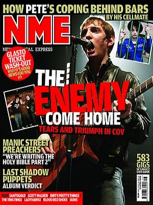 NME' stands for New Musical Express and is an indie/rock music based magazine. The title on its own suggests a 'rocky' music related magazine. The way it is presented as 'NME' provides the reader with a short and snappy title to read and most importantly it is easily recognisable and memorable. This can have a positive impact on the popularity of the magazine as it will be known about. Not only this, but interpreting the title in the way it is spoken, gives a different approach to the magazine as it said as the word 'enemy'. This could suggest a range of things about the style of the magazine and what is featured inside. Some previous covers of 'NME' actually state the word 'enemy' indirectly related to the title. This may prompt the reader to view the magazine in a certain way with a slight edgy feel.
'WE LOVE POP' is a fun magazine, that (as strongly suggested by the title) focuses mainly on pop music. The words on their own would automatically attract a consumer who is interested in pop. The word 'we' creates a sense of belonging to a group of people who like pop music. The love heart instead of the word 'love' promotes the idea of the magazine being targeted at younger people rather than older as it adds to the 'fun' factor to the title. The simple yet effective title of the magazine is made to relate to the type of information featured in the magazine and attract potential consumers.
 'Billboard' is a magazine that does not have a specific genre of music to cater for so therefore features many artists regardless of the genre of music they produce. Originally it was titled 'Billboard Advertising' it was a trade paper for the bill posting industry, hence the magazine's name. However to me, the format of a typical 'Billboard' magazine front cover conveys the idea of a literal billboard to display important notices. There is generally a running theme on the front covers of head and shoulders or mid shots to display the artist. The text is structured to fit around this image. This structure portrays the idea of a billboard and would give the idea that the artist and the information within the magazine is important to display.
 New term, new task!
It is now time to put my new found knowledge of the music industry into practice! We have been set the task of creating our very own music magazine's front cover, contents page and double page spread.
To help me in the planning of my magazine, it is useful to look at what magazines are already successful in the market. To carry this out I have 'deconstructed' two, well known music magazines' front covers. 'TOP of the POPS' and 'Billboard' magazine are both magazines I have chosen to look at as I am aiming to base my own magazine on the 'pop music' genre. However I am still not fully decided on whether my magazine will be aimed at younger, or older teenagers (target audience). By deconstructing these two different magazines, I have gained an insight on the typical conventions of a magazine and its effectiveness. These have given me different ideas on how to construct my own magazine. Taking inspiration from both existing magazines and my own ideas, I will hopefully be able to create an authentic, yet 'new' magazine.
To help me in the planning of my magazine, it is useful to look at what magazines are already successful in the market. To carry this out I have 'deconstructed' two, well known music magazines' front covers. 'TOP of the POPS' and 'Billboard' magazine are both magazines I have chosen to look at as I am aiming to base my own magazine on the 'pop music' genre. However I am still not fully decided on whether my magazine will be aimed at younger, or older teenagers (target audience). By deconstructing these two different magazines, I have gained an insight on the typical conventions of a magazine and its effectiveness. These have given me different ideas on how to construct my own magazine. Taking inspiration from both existing magazines and my own ideas, I will hopefully be able to create an authentic, yet 'new' magazine.
Tuesday, 24 January 2012
Deconstruction:
TOP of the POPS : Front Cover

I have annotated the main features of this particular magazine cover. I have chosen this magazine to look at as I am thinking of researching further into the pop genre to base my own magazine on.

Deconstruction:
Billboard Magazine : Front Cover
Here I have annotated where I thought there showed some typical conventions of a music magazine specifically to Billboard Magazine. I have picked up on the different features of the cover and attempted to explain its effectiveness.

Friday, 20 January 2012
Will Jessie J be able to climb her way up the charts?

Currently standing at number 8 in the UKHot40 charts, Jessie J's brand new single 'Domino' leaves us all wondering whether over the weeks this exciting new track will be able to battle for the top spot against Flo Ridas 'Good Feeling'. We'll just have to wait and see!
This song relates to the pop genre and I feel that I know a lot about this particular genre to work with on my project.
Subscribe to:
Comments (Atom)